
📊 Bivariate Statistics Study Notes
Complete Guide for IB Mathematics
Correlation, Regression & Data Analysis
📚 Study Guide Navigation
📌 Introduction to Bivariate Statistics
Bivariate statistics analyzes the relationship between two variables. Unlike univariate statistics (which examines one variable), bivariate analysis helps us understand how changes in one variable relate to changes in another.
For example: Does study time affect exam scores? Is there a relationship between height and weight? Do temperature and ice cream sales correlate? These questions require bivariate analysis.
🎯 Why Bivariate Statistics in IB Mathematics?
- Essential Topic: Core component of IB Math AA and AI curricula at both SL and HL levels
- Exam Weight: Typically 10-15% of Statistics & Probability marks across Papers 1 and 2
- Real-World Applications: Used in economics, medicine, social sciences, business analytics, and research
- Technology Integration: Requires proficiency with GDC (graphic display calculator) for calculations
- Foundation for Advanced Stats: Essential for hypothesis testing, regression analysis, and data science
- Cross-Curricular Links: Applied in IB sciences (biology, chemistry, physics) and economics
Key Terminology
🔢 Bivariate Data
Data collected on two variables for each observation. Represented as ordered pairs (x, y).
Example: (hours studied, exam score), (temperature, ice cream sales)
📊 Variables Types
Independent Variable (x): The variable you control or predict from
Dependent Variable (y): The variable that responds or is predicted
🔗 Correlation
A statistical measure describing the strength and direction of the linear relationship between two variables.
📐 Regression
The process of finding a mathematical equation (usually linear) that best models the relationship between variables.
📈 Scatter Plots (Scatter Diagrams)
A scatter plot is a graphical representation of bivariate data where each observation is plotted as a point with coordinates (x, y).
Creating a Scatter Plot:
- Place the independent variable (x) on the horizontal axis
- Place the dependent variable (y) on the vertical axis
- Plot each data pair as a point (x, y)
- Label axes clearly with variable names and units
- Add a title describing the relationship being examined
Types of Correlation Patterns
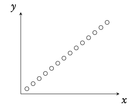
✅ Positive Correlation
As x increases, y tends to increase.
Points slope upward from left to right.
Examples: Height vs Weight, Study Time vs Exam Score
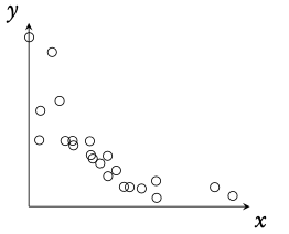
❌ Negative Correlation
As x increases, y tends to decrease.
Points slope downward from left to right.
Examples: Age of Car vs Value, Practice Time vs Errors
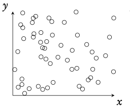
⭕ No Correlation
No clear linear pattern between variables.
Points scattered randomly.
Examples: Shoe Size vs IQ, Height vs Favorite Color
⚡ Non-Linear Relationship
Clear pattern exists but not linear.
May be quadratic, exponential, etc.
Note: IB focuses on linear correlation
Strength of Correlation
The strength of correlation refers to how closely points cluster around a line:
- Strong: Points lie very close to a straight line (|r| close to 1)
- Moderate: Points show clear trend but more scattered (|r| around 0.5-0.7)
- Weak: Points very scattered, trend barely visible (|r| close to 0)
🔗 Pearson's Correlation Coefficient (r)
The Pearson correlation coefficient (denoted as r) is a numerical measure that quantifies the strength and direction of the linear relationship between two variables.
Where:
n = number of data pairs
Σxy = sum of products of paired values
Σx = sum of x values
Σy = sum of y values
Σx² = sum of squared x values
Σy² = sum of squared y values
Interpretation of r Values
| Value of r | Interpretation | Strength & Direction |
|---|---|---|
| +1.0 | Perfect positive correlation | All points lie exactly on an upward line |
| +0.7 to +1.0 | Strong positive correlation | Points cluster tightly around upward line |
| +0.3 to +0.7 | Moderate positive correlation | Visible upward trend, moderate scatter |
| 0 to +0.3 | Weak positive correlation | Slight upward tendency, high scatter |
| 0 | No linear correlation | No linear pattern visible |
| −0.3 to 0 | Weak negative correlation | Slight downward tendency, high scatter |
| −0.7 to −0.3 | Moderate negative correlation | Visible downward trend, moderate scatter |
| −1.0 to −0.7 | Strong negative correlation | Points cluster tightly around downward line |
| −1.0 | Perfect negative correlation | All points lie exactly on a downward line |
Calculating r with GDC (TI-84 Plus)
Step-by-Step GDC Instructions:
- Press STAT → 1: Edit
- Enter x-values in L1
- Enter y-values in L2
- Press STAT → CALC → 4: LinReg(ax+b)
- Specify: Xlist: L1, Ylist: L2
- Press CALCULATE
- Read the value of r from the output
Note: If r doesn't appear, turn on diagnostics: 2nd → 0 (CATALOG) → DiagnosticOn → ENTER
📝 Worked Example 1
Calculate the correlation coefficient for this data:
| x | 2 | 4 | 6 | 8 | 10 |
|---|---|---|---|---|---|
| y | 3 | 7 | 9 | 11 | 15 |
n = 5
Σx = 2 + 4 + 6 + 8 + 10 = 30
Σy = 3 + 7 + 9 + 11 + 15 = 45
Σxy = (2×3) + (4×7) + (6×9) + (8×11) + (10×15) = 6 + 28 + 54 + 88 + 150 = 326
Σx² = 4 + 16 + 36 + 64 + 100 = 220
Σy² = 9 + 49 + 81 + 121 + 225 = 485
r = [n(Σxy) − (Σx)(Σy)] / √{[n(Σx²) − (Σx)²][n(Σy²) − (Σy)²]}
r = [5(326) − (30)(45)] / √{[5(220) − (30)²][5(485) − (45)²]}
r = [1630 − 1350] / √{[1100 − 900][2425 − 2025]}
r = 280 / √{200 × 400}
r = 280 / √80000
r = 280 / 282.84
r ≈ 0.99
r ≈ 0.99 indicates a very strong positive correlation. As x increases, y increases almost perfectly linearly.
📐 Linear Regression (Line of Best Fit)
Linear regression finds the equation of the straight line that best fits the data points. This line minimizes the sum of squared vertical distances between the points and the line (least squares method).
y = ax + b
or alternatively written as:
y = mx + c
Where:
a (or m) = slope of the line
b (or c) = y-intercept
x = independent variable
y = predicted dependent variable
Least Squares Method Formulas
The coefficients are calculated using:
Where:
x̄ = mean of x values = (Σx)/n
ȳ = mean of y values = (Σy)/n
Finding Regression Equation with GDC
GDC Method (TI-84 Plus):
- Enter data in L1 (x) and L2 (y) as before
- Press STAT → CALC → 4: LinReg(ax+b)
- The calculator displays:
a = slope
b = y-intercept
r² = coefficient of determination
r = correlation coefficient - Write equation as: y = ax + b (substitute values)
Using the Regression Line
Once you have the regression equation, you can:
📊 Make Predictions
Substitute a value of x into the equation to predict y
Example: If y = 2x + 3, when x = 5, then y = 2(5) + 3 = 13
⚠️ Interpolation vs Extrapolation
Interpolation: Predicting within data range (reliable)
Extrapolation: Predicting outside data range (less reliable, use caution)
📝 Worked Example 2
Using the data from Example 1, find the regression line equation and predict y when x = 7.
x: 2, 4, 6, 8, 10
y: 3, 7, 9, 11, 15
n = 5, Σx = 30, Σy = 45, Σxy = 326, Σx² = 220
a = [n(Σxy) − (Σx)(Σy)] / [n(Σx²) − (Σx)²]
a = [5(326) − (30)(45)] / [5(220) − (30)²]
a = [1630 − 1350] / [1100 − 900]
a = 280 / 200
a = 1.4
x̄ = Σx/n = 30/5 = 6
ȳ = Σy/n = 45/5 = 9
b = ȳ − a·x̄
b = 9 − 1.4(6)
b = 9 − 8.4
b = 0.6
y = 1.4(7) + 0.6
y = 9.8 + 0.6
y = 10.4
Coefficient of Determination (r²)
r² represents the proportion of variance in y that is explained by x:
- r² = 0.81 means 81% of variation in y is explained by the linear relationship with x
- r² = 0.25 means only 25% is explained; 75% is due to other factors
- Higher r² indicates better fit of the regression line to the data
- r² is always between 0 and 1 (0% to 100%)
💡 Interpretation & Causation
Understanding Correlation vs Causation
Just because two variables are correlated doesn't mean one causes the other. There are several possible explanations for correlation:
1️⃣ Direct Causation
X actually causes Y
Example: Smoking (X) causes lung cancer risk (Y)
2️⃣ Reverse Causation
Y actually causes X (opposite direction)
Example: Sales increase advertising, not vice versa
3️⃣ Confounding Variable
Third variable Z causes both X and Y
Example: Ice cream sales and drowning both caused by summer heat
4️⃣ Coincidence
Pure chance, especially with small samples
Example: Number of Nicolas Cage films vs pool drownings
Common Mistakes to Avoid
❌ Mistake 1: Assuming Causation
"Height and weight are correlated, so height causes weight"
✓ Correct: "Height and weight are correlated; taller people tend to weigh more"
❌ Mistake 2: Ignoring r² Values
Treating r = 0.3 the same as r = 0.9
✓ Correct: Check both r and r² to assess strength
❌ Mistake 3: Extrapolation Overconfidence
Using regression line far beyond data range
✓ Correct: Note when predictions are extrapolations; use caution
❌ Mistake 4: Assuming Linearity
Applying linear r to clearly curved relationships
✓ Correct: Check scatter plot first; linear r only for linear trends
IB Exam Context Language
📝 How to Write Contextual Answers
- Always use context: Don't say "as x increases, y increases" – say "as study hours increase, exam scores tend to increase"
- Use qualifying language: "tends to," "suggests," "is associated with" instead of "causes"
- Interpret r values: "r = 0.85 indicates a strong positive correlation between..."
- Describe practical meaning: "For every additional hour studied, exam score increases by approximately 5 marks"
- Note limitations: "This is interpolation/extrapolation" or "correlation doesn't prove causation"
✍️ Interactive Practice Problems
Test your understanding with these IB-style bivariate statistics problems!
Question 1: Correlation Interpretation
What does this correlation coefficient tell us?
Enter the strength (strong/moderate/weak) and direction (positive/negative):
📖 Solution
This indicates a STRONG correlation
As TV hours increase, GPA tends to decrease
Question 2: Prediction Using Regression
y = 15x + 50
Predict ice cream sales when temperature is 25°C.
📖 Solution
y = 15(25) + 50
y = 375 + 50
y = 425
Question 3: Calculate Mean Values
| x | 5 | 10 | 15 | 20 |
|---|---|---|---|---|
| y | 12 | 18 | 24 | 30 |
📖 Solution
Σx = 5 + 10 + 15 + 20 = 50
n = 4
x̄ = Σx / n = 50 / 4 = 12.5
Σy = 12 + 18 + 24 + 30 = 84
n = 4
ȳ = Σy / n = 84 / 4 = 21
Question 4: r² Interpretation
(Calculate r² and express as percentage)
📖 Solution
r² = (0.8)²
r² = 0.64
0.64 × 100% = 64%
The remaining 36% is due to other factors or randomness.
Question 5: Causation Question
Does this prove that larger feet cause better reading? (yes/no)
📖 Solution
Correlation does NOT imply causation!
• Older children have larger feet
• Older children have better reading ability
• Age causes BOTH variables to increase together
🎓 IB Exam Tips & Strategy
📝 Essential Exam Techniques
- Always Use GDC: Calculate r and regression equations using your calculator; show you did this by writing "Using GDC, r = ..."
- Write in Context: Replace x and y with actual variable names from the question
- State Units: Include units when making predictions (e.g., "82 marks" not just "82")
- Describe Correlation Fully: Mention both strength AND direction (e.g., "strong positive correlation")
- Check for Causation Traps: If asked about causation, mention confounding variables or state "correlation ≠ causation"
- Interpolation vs Extrapolation: Note when predictions fall outside the data range
- Draw Scatter Plot: If asked to draw, use ruler, label axes clearly, plot accurately
⏰ Time Management
- Calculating r: 2-3 minutes (mainly GDC time)
- Finding regression equation: 2-3 minutes
- Making predictions: 1-2 minutes
- Interpretation questions: 3-5 minutes (require careful wording)
- Drawing scatter plots: 4-6 minutes
📌 Quick Reference Summary
Key Formulas & Concepts
| r value | Strength |
|---|---|
| ±0.9 to ±1.0 | Very strong |
| ±0.7 to ±0.9 | Strong |
| ±0.5 to ±0.7 | Moderate |
| ±0.3 to ±0.5 | Weak |
| 0 to ±0.3 | Very weak/None |
Remember: CORRELATION ≠ CAUSATION!
👨🏫 About the Author
Adam
Co-Founder @ RevisionTown
Math Expert in Various Curricula: IB, AP, GCSE, IGCSE, A-Levels
Specializing in statistics education with focus on real-world applications and exam success. Helping students master bivariate analysis through clear explanations, worked examples, and interactive practice.
📊 Master bivariate statistics and excel in data analysis!
Visit RevisionTown.com for more IB resources
Bivariate statistics are about relationships between two different variables. You can plot your individual pairs of measurements as (x, y) coordinates on a scatter diagram. Analysing bivariate data allows you to assess the relationship between the two measured variables; we describe this relationship as correlation.
Scatter diagrams
Perfect positive correlation
r = 1
No correlation
r = 0
Weak negative correlation
−1 < r < 0
7.4.1 Regression line
The regression line is a linear mathematical model describing the relationship between the two measured variables. This can be used to find an estimated value for points for which we do not have actual data. It is possible to have two different types of regression lines: y on x (equation y = ax + b), which can estimate y given value x, and x on y (equation x = y c + d ), which can estimate x given value y . If the correlation between the data is perfect, then the two regression lines will be the same.
However one has to be careful when extrapolating (going further than the actual data points) as it is open to greater uncertainty. In general, it is safe to say that you should not use your regression line to estimate values outside the range of the data set you based it on.
7.4.2 Pearson’s correlation coefficient (−1 ≤ r ≤ 1)
Besides simply estimating the correlation between two variables from a scatter diagram, you can calculate a value that will describe it in a standardised way. This value is referred to as Pearson’s correlation coefficient (r).
r = 0 means no correlation.
r ± 1 means a perfect positive/negative correlation.
Interpretation of r -values:

Calculate r while finding the regression equation on your GDC. Make sure that STAT DIAGNOSTICS is turned ON (can be found in the MODE settings), otherwise the r − value will not appear.
When asked to “comment on” an r − value make sure to include both, whether the correlation is:
- positive / negative and
- strong / moderate / weak / very weak
Bivariate-statistics type questions
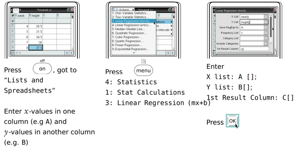
The height of a plant was measured the first 8 weeks

- Plot a scatter diagram
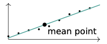
2. Use the mean point to draw a best fit line
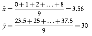
3. Find the equation of the regression line Using GDC
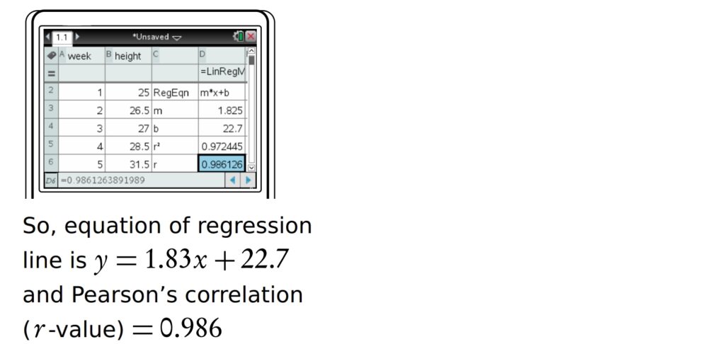
Pearson’s correlation is r = 0.986, which is a strong positive correlation.