Statistical graphs

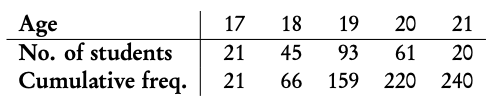
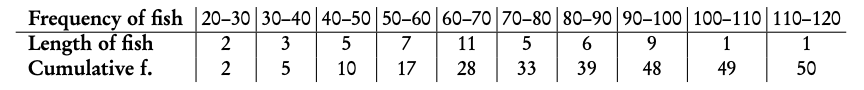
Frequency the number of times an event occurs in an experiment

Cumulative frequency the sum of the frequency for a particular class and the frequencies for all the classes below it

Statistical graphs
statistical graphs
A histogram is used to display the frequency for a specific condition. The frequencies (here: # of students) are displayed on the y-axis, and the different classes of the sample (here: age) are displayed on the x-axis. As such, the differences in frequency between the different classes assumed in the sample can easily be compared.
statistical graph
The cumulative frequency graph is used to display the development of the frequencies as the classes of the event increase. The graph is plotted by using the sum of all frequencies for a particular class, added to the frequencies for all the classes below it. The classes of the event (age) are displayed on the x-axis, and the frequency is displayed on the y-axis. The cumulative frequency graph always goes upwards, because the cumulative frequency increases as you include more classes.
statistical graphs

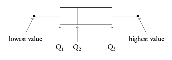
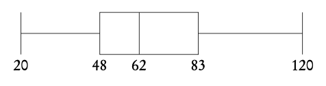
Box and whisker plots neatly summarize the distribution of the data. It gives information about the range, the median and the quartiles of the data. The first and third quartiles are at the ends of the box, the median is indicated with a vertical line in the interior of the box, and the maximum and minimum points are at the ends of the whiskers.

Outliers will be any points lower than Q1 − 1.5 × IQR and larger than Q3 + 1.5 × IQR (IQR =interquartile range)
To identify the value of Q1, Q2 and Q3, it is easiest to use the cumulative frequency graph. First, determine the percentage of the quartile in question. Second, divide the total cumulative frequency of the graph (i.e. the total sample size) by 100 and multiply by the corresponding percentage. Then, you will have found the frequency (y-value) at which 25% for Q1 / 50% for Q2 / 75% for Q3 of the sample is represented. To find the x-value, find the corresponding x-value for the previously identified y-value.

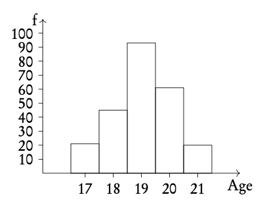
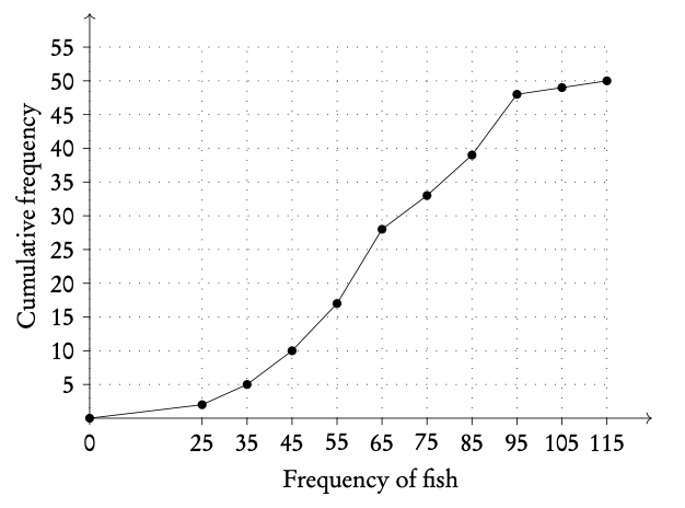
Example: Using the histogram, create a cumulative frequency graph and use it to construct a box and whisker diagram.

statistical graphs

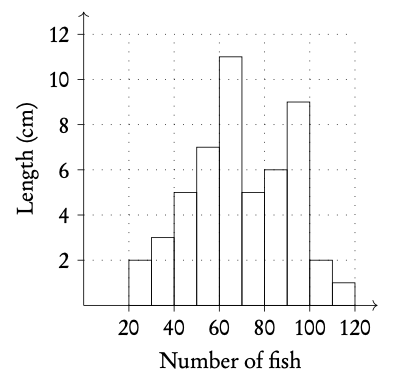
Write out the table for frequency and cumulative frequency.

statistical graphs
Plot on cumulative frequency chart. Remember to use the midpoint of the date, e.g., 25 for 20–30.
statistical graphs
Use graph to find Q1, Q2 and Q3.
statistical graphs

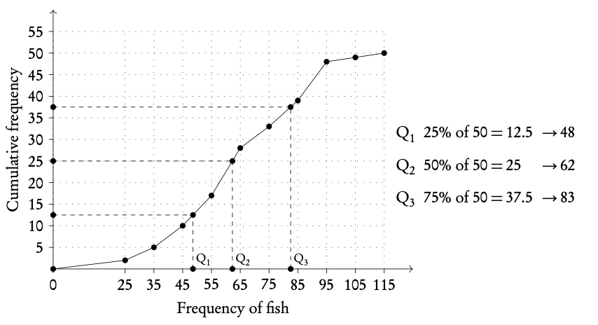
Plot box and whiskers.
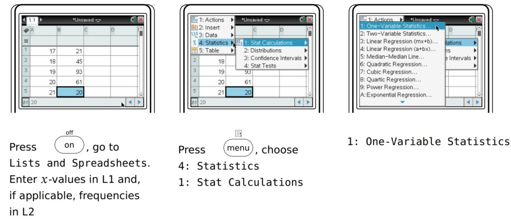
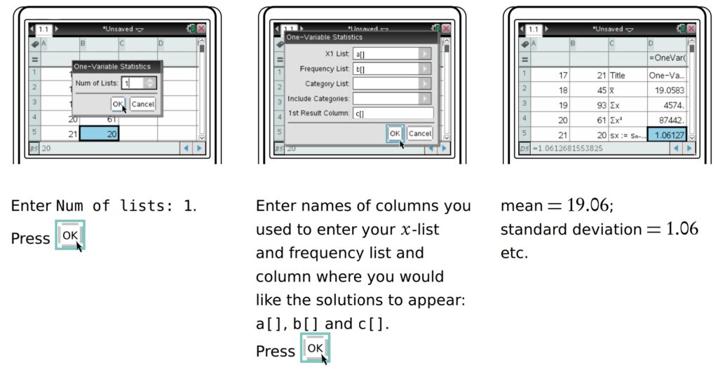
statistical graphs

GDC

Finding the mean, standard deviation and quartiles etc.

Find the descriptive statistics for the data used in the previous example, showing the ages of students.

statistical graphs
statistical graphs